Dialca UI — React Component Library
Dialca UI is a modern, scalable React component library built with TypeScript and Tailwind CSS, designed to help developers create consistent user interfaces with minimal setup and maximum flexibility.
It focuses on developer experience, accessibility, and clean design patterns, making it suitable for real-world applications—not just demos.
✨ Key Features
-
🎨 Design-system friendly
Components are easy to theme and extend using Tailwind CSS utilities. -
♿ Accessibility by default
Built following WAI-ARIA guidelines to ensure inclusive and usable components. -
🔧 TypeScript-first API
Strongly typed components with predictable props and full IDE autocompletion. -
📦 Optimized & tree-shakeable
Import only what you need, keeping bundle sizes small and efficient. -
📱 Responsive out of the box
Mobile-first components that adapt naturally to different screen sizes.
🚀 Why Dialca UI?
Unlike generic UI kits, Dialca UI is built with real application needs in mind:
- Clean and explicit component APIs
- Consistent styling and layout patterns
- Easy integration into existing React projects
- No heavy abstractions or unnecessary dependencies
Think of it as a practical UI foundation, not a locked-in framework.
Clean components > magic components.
📦 Installation
npm install dialca-ui
# or
yarn add dialca-ui
# or
pnpm add dialca-ui
🧩 Basic Usage
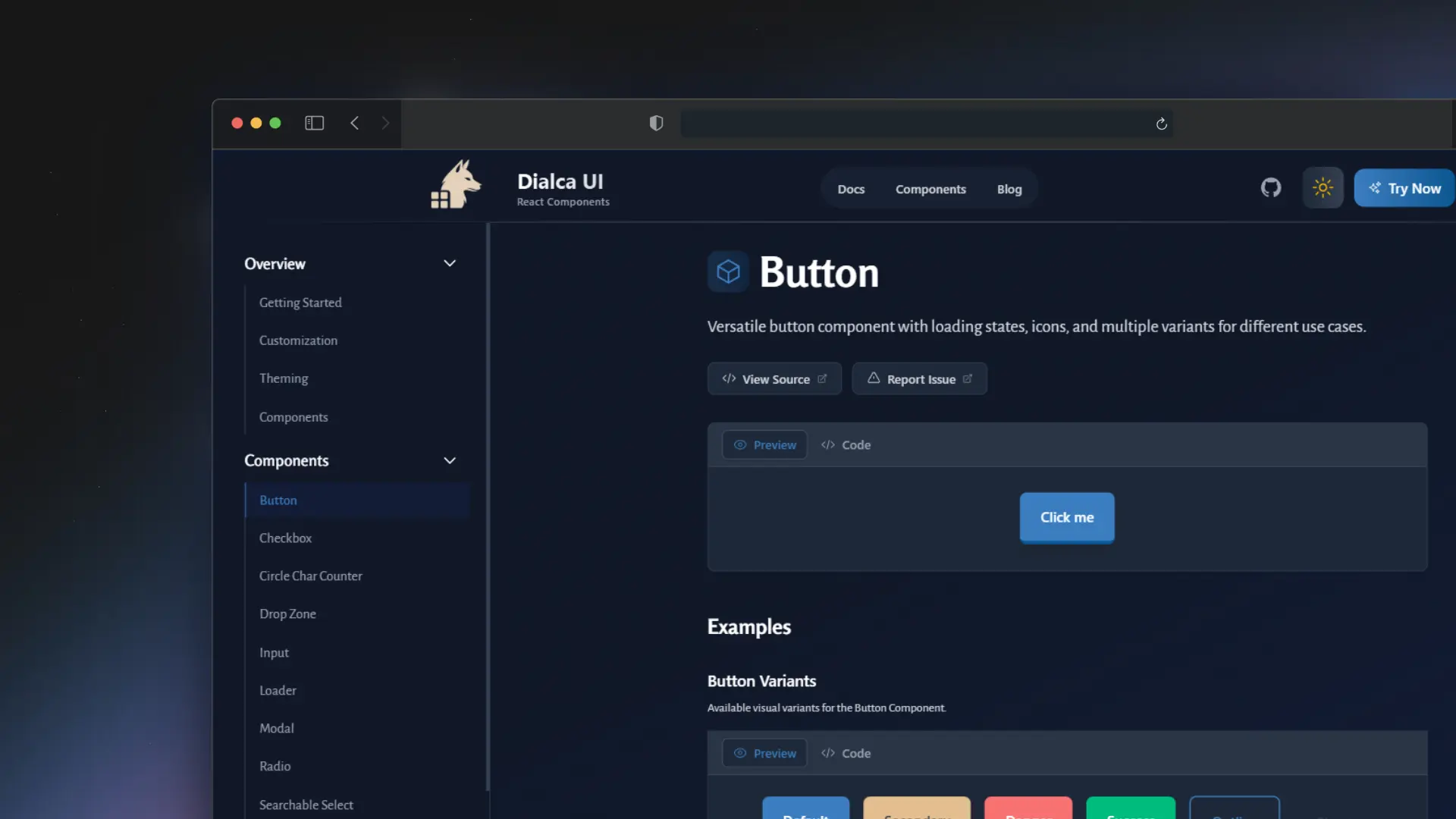
import { Button, Card } from 'dialca-ui';

export function App() {
  return (
    <Card>
      <Button variant="primary">
        Click me
      </Button>
    </Card>
  );
}
Components are fully typed and customizable using Tailwind utility classes or predefined variants.